Repackaging womens health.
The way in which women’s personal care products are viewed is changing. We’re seeing a fresh approach to product, branding, packaging and even the retail model. Moving an everyday essential chucked into a supermarket trolley, into a desirable lifestyle-led purchase.
Messages of female empowerment have been seen emerging across media and advertising in recent years. In line with this, we’ve seen more open conversations around women’s bodies – from stretch marks to post-partum stomachs, plus-size catwalks models to periods.
This shift aligns with the continually growing interest in health and wellbeing, and is filtering down into all kinds of product packaging and branding that are aimed at women. Perhaps the most interesting is the refresh that is being given to branding and packaging for period products.
While there used to be just a few big players in the feminine hygiene space, these brands are starting to look a little outdated in line with the new social attitudes that are emerging. We’re now seeing an influx of new, smaller brands make waves in this market.
CHALLENGING THE NORM
Thinx were one of the first start-ups to rethink how women experience their periods. The US-based brand sells absorbent, moisture-wicking underwear that can be worn during a period alone or as a back-up to a tampon or cup. A clever idea, but it was really the branding and styling, rather than the products, that made this brand an overnight success.
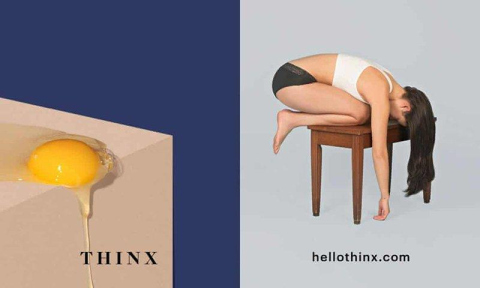
The brand’s advertising looks more like a edgy fashion campaign than the typically homely imagery associated with period products. Suggestive images of halved grapefruits and broken eggs lend a humorous and slightly risque feel, which appeal to its Millennial target audience. Its bold attitude was perhaps helped along further by the fact it appalled others in equal measure, with calls for the adverts to be banned on the New York subway.
Now available outside of the States too, Thinx has kept its allure. As evidenced by it recently being sold at a ‘feminist-themed’ pop-up store in London alongside up-and-coming ethical fashion label, Birdsong London. Not the usual location to sell sanitary products, it demonstrates how the brand is pitching itself a premium, lifestyle brand that aligns with its customers’ values.
BORROWING DESIGN CUES
Take a look at L.’s Instagram and sanitary products is not likely to be the first thing to spring to mind. The feed is a mixture of on-trend nude illustrations, empowering quotes and stylised photos of diverse groups of women. The brand typifies the rebranding of this industry to be in sync with notion of wellbeing.
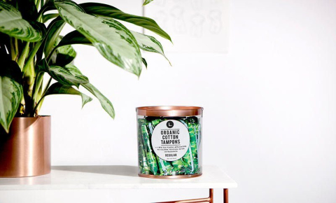
L. declares itself to be breaking the shame around periods, with it’s ‘designed for display’ packaging a key component of this. The packaging blatantly borrows design cues from high-street homeware trends. The tampons themselves are wrapped in palm-leaf print wrappers while the clear plastic tubs that house them are made from repurposed plastic bottles and feature a copper-coloured base and lid. This modern packaging elevates L.’s products to a an almost luxury purchase, rather than a basic FMCG.
NEW FORMATS
The desire for delivered-to-your-door convenience has seen the subscription model gradually gain traction in recent years, particularly when it comes to cosmetics and personal hygiene products. So it’s no surprise that considering the once-a-month need for period products, many brands are subverting the standard retail model and selling direct to consumers instead.
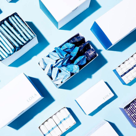
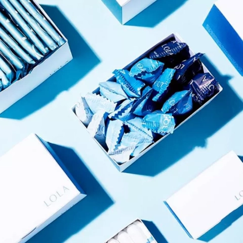
LOLA is just one of many examples, with the brand inviting women to build a monthly subscription box using a combination of products that works for them. The minimal packaging design is akin to the styling of skincare products and makes it a far more sophisticated alternative to mainstream brands. Crisp white boxes feature details in calming cool tones of blue, purple and teal that coordinate with the products inside.
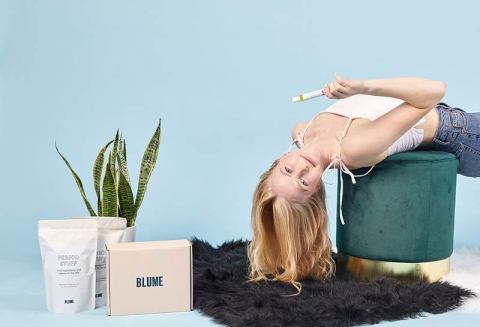
Blume offers a similar service, but is aimed specifically at young women with witty comments on its website and cute illustrations giving it a teen-friendly approach. Pitching itself as a ‘self-care’ brand, Blume doesn’t just deliver sanitary products in its monthly boxes, with customers able to choose from a range of beauty and cosmetic items too, as well as opting for a monthly treat (normally chocolate) and herbal tea to soothe hormone-induced blues.
PLAYFUL PRODUCTS
Rising concerns over plastic pollution are seeing consumers seek reusable alternatives to everyday products. This shift has hit the feminine hygiene market too, with Google stating that searches regarding menstrual cups have soared in the last few years. Once associated with a greener, slightly hippy lifestyle, these products are coming into the mainstream, helped along by a modern approach to packaging and branding.
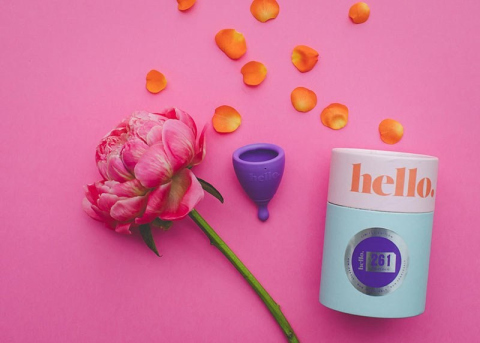
While there are many brands on the market, the Hello cup, designed and made in New Zealand, stands out for its bold, colourful design. The cardboard tube-style packaging combines tones of Millennial pink and light blue, giving it eye-catching shelf appeal. The cups themselves are also coloured to differentiate from other brands and are made from a medical-grade plastic that is also recyclable at the end of its life.
Emphasising its position as a lifestyle-inspired brand with a mission, Hello has a special edition cup produced in collaboration with 261 Fearless, a global running network for women that focuses on empowerment through running.
WHAT DOES THIS MEAN FOR YOUR BRAND?
The reason why the shift in the period product market is so notable is that it demonstrates a direct impact of how changing consumer attitudes influence the types of products people buy. In this case, the social shift towards female empowerment and breaking down taboos is being directly translated into packaging and branding for period products that are slowly becoming lifestyle-driven purchases, rather than simply a basic essential. But the evolution of the period product market is not the first and will not be the last to be affected by changing social attitudes. Do you know what your consumers care about and how that will impact the decisions they make about your product? We can help you translate these ideas into practical and eye-catching packaging that keeps your brand up-to-date.