Olive Oil Packaging Gets Sexy
Olive oil is one of those condiments that most people take for granted, like salt or pepper. When asked, there is probably only two kinds of olive oil that people are consciously aware of – virgin, and extra virgin. This isn’t necessarily a bad thing, but it does mean that most people are missing out on a myriad of amazing flavours and combinations. As well as being great in cooking, it’s great to your mind and body too – used in moderation, of course. Olive oil packaging can be just as fabulous, as you will see below with our pick of the best packaging designs.
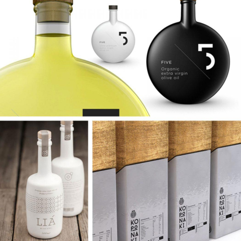
Corona Greek Olive Oil
Taking inspiration from the earth itself, the design for this minimalistic set is as stunning as it is ‘simple’.
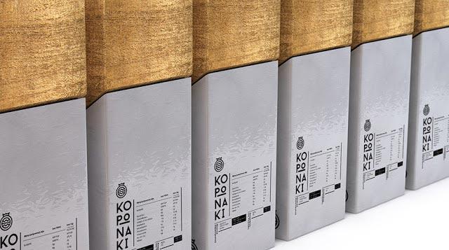
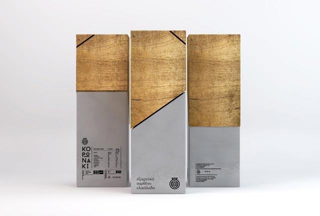

Each element of the package design created for Koronaki is perfectly placed with the other, creating an extraordinarily stylish presentation. Designed by Thomas Kiourtsis, what has been created here is a minimalistic identity that, along with the packaging, make for a well balanced set.
5 Olive Oil Packaging
Reminiscent of perfume containers, or even premium brandy, the package design for 5 Olive Oil is nothing short of spectacular. From the matt black to the transparent, each design is the epitome of premium quality packaging.
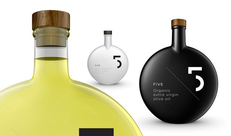
There isn’t much chance of this going unnoticed on the store shelf, or in your kitchen. When something looks this good, you may find yourself reluctant to open it!
L’olio Biologico Cuonzo
The need to appear modern and innovative, while still paying homage to traditional practices and values, is an important driving force behind many companies. Olive oil has been used for thousands of years, so there is certainly a lot of history to draw from.
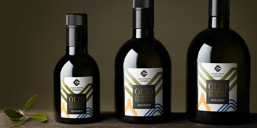
Going back to one of the more traditional container designs was an obvious choice to make, but one that works so well. Modern lines, bright colours and sharp typography make this an excellent blend of old and new. Created by design agency EMMECIDUE, the company logo was deconstructed and used as the background for the label, with striking colouring added for effect.
Olive Oil Cooperative Of Viannos
When thinking of olive oil, or any other product for that matter, we very rarely think of the talent pool that made it possible. That all changed with the truly unique packaging of the olive oil from the Cooperative of Viannos.
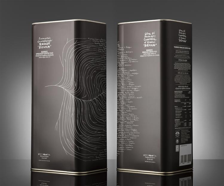
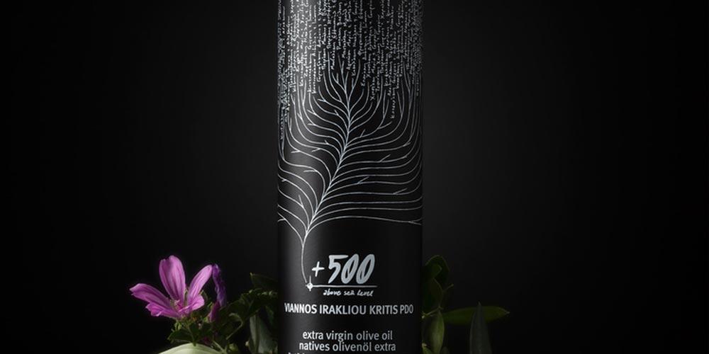
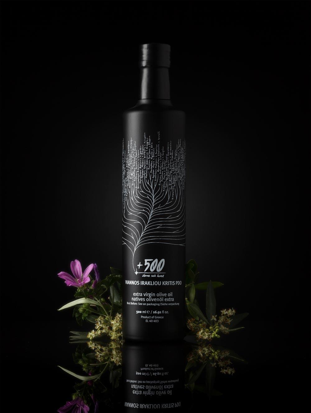
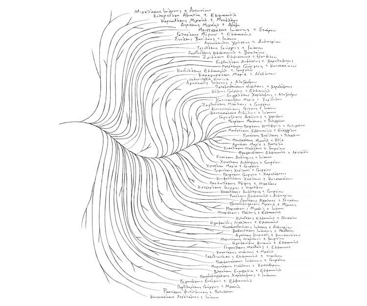
The names of everyone responsible for the creation of this olive is printed right there on the packaging, for everyone to see. If the product had a family tree, it’s producers would certainly be its leaves and that’s exactly how they’ve been represented here – as a part of the packaging and history of the oil itself.
Olive by Gino’s Garden
With just 6 hours separating the pressing from the picking of the olive, this exquisite oil is short supply.
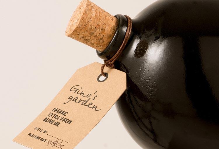
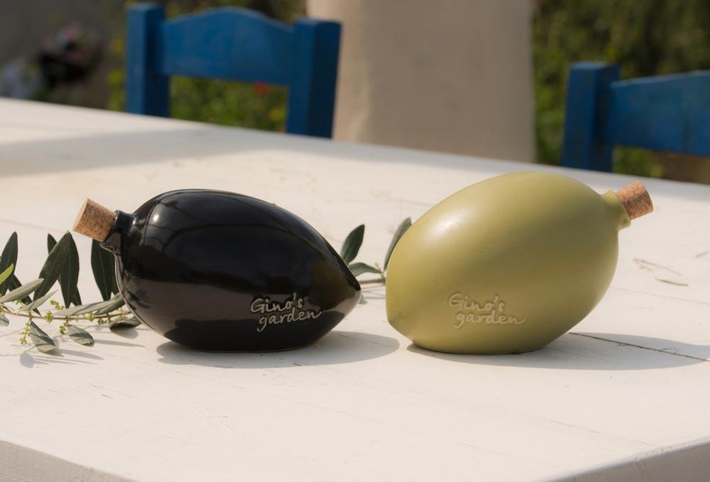
The exclusivity of this product is reflected in the design of the packaging itself, with a kind of back-to-basics approach, in the olive shaped container. Each of these wonderful containers is made from ceramics, lovingly hand crafted by Stelios Laskaris.
Ñ | Organic: Organic Olive Oil
Replacing the tilde with the shape of an olive leaf, which makes up a part of the logo, was a masterstroke. Visually appealing, relevant and using the most vibrant of colouring this packaging design is not one that will be forgotten easily.
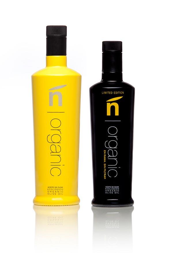
Once in awhile a simple, yet fantastically striking design comes along that ignites the imagination and this is one of them!
Hi. I Want To Follow You
It’s not often that a product that has the ability to speak to you, but this one certainly does. Hi. I Want To Follow You, features a large, single, eye that does its best to follow you around the room. While it may not succeed completely, it is certainly memorable.
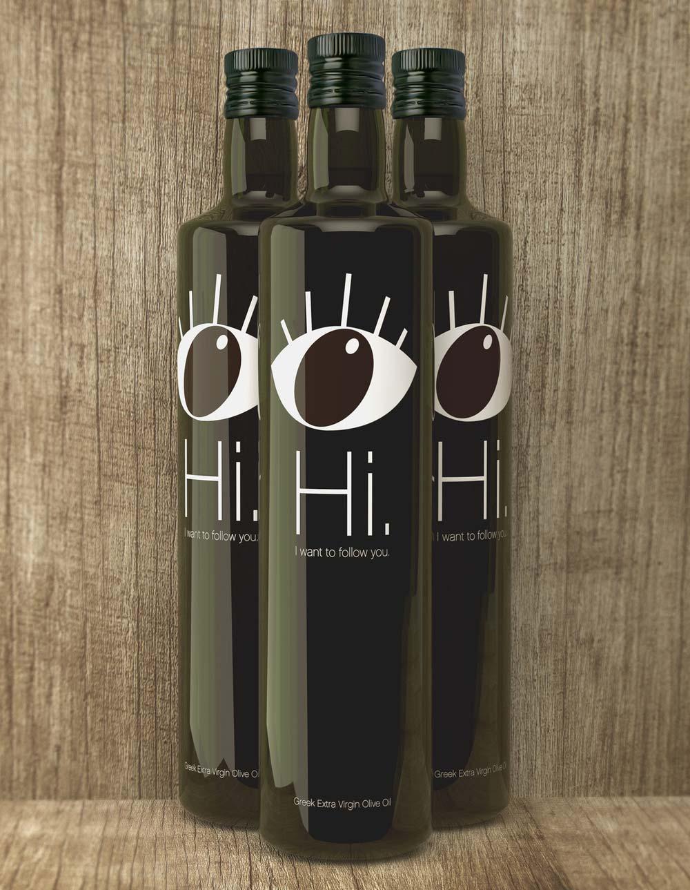
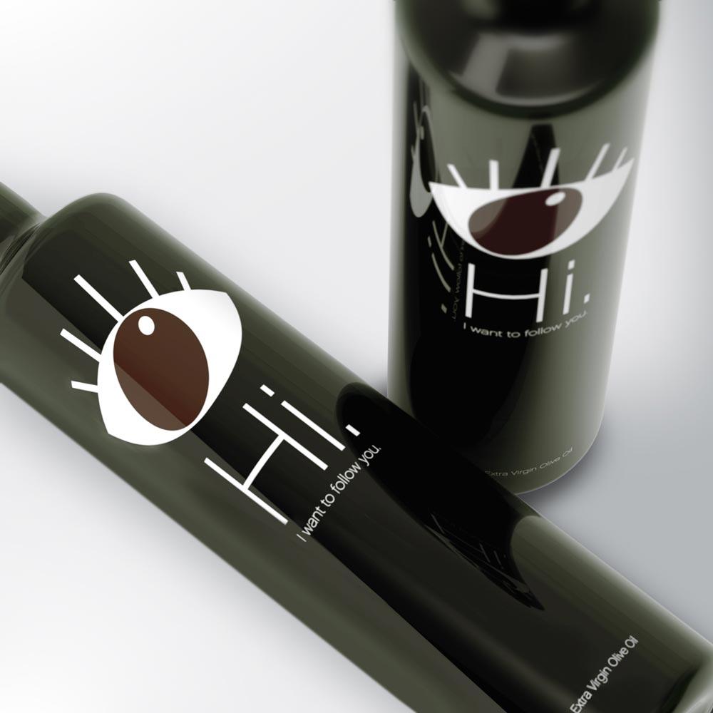
Created by Matadog Design, this is a package design worthy of gracing any kitchen side, ready to be included in everything that you do.
Olia
“Liquid gold from the Gods!” is the proud proclamation adorning this unusual packaging. Looking very much like a precious liquids container, the packaging for Olia is striking to say the least.
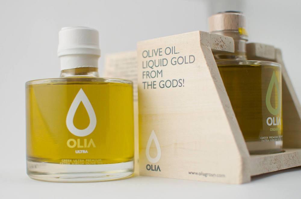
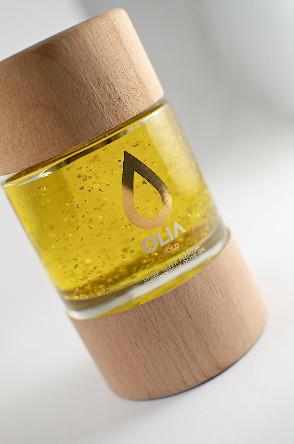
From the tear-drop logo to the clean and crisp lettering, everything about this design says ‘premium’.
Lia Olive Oil
Reminiscent, and perhaps intentionally, of the ornamental vases and bottles of ancient Greece, Lia Olive Oil containers are simply beautiful.
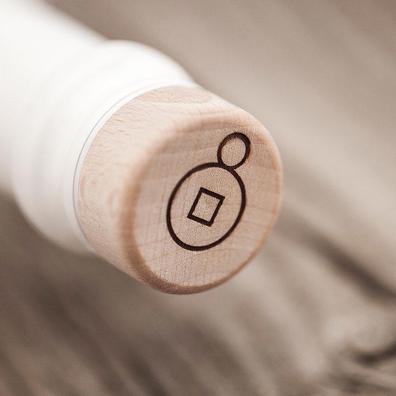
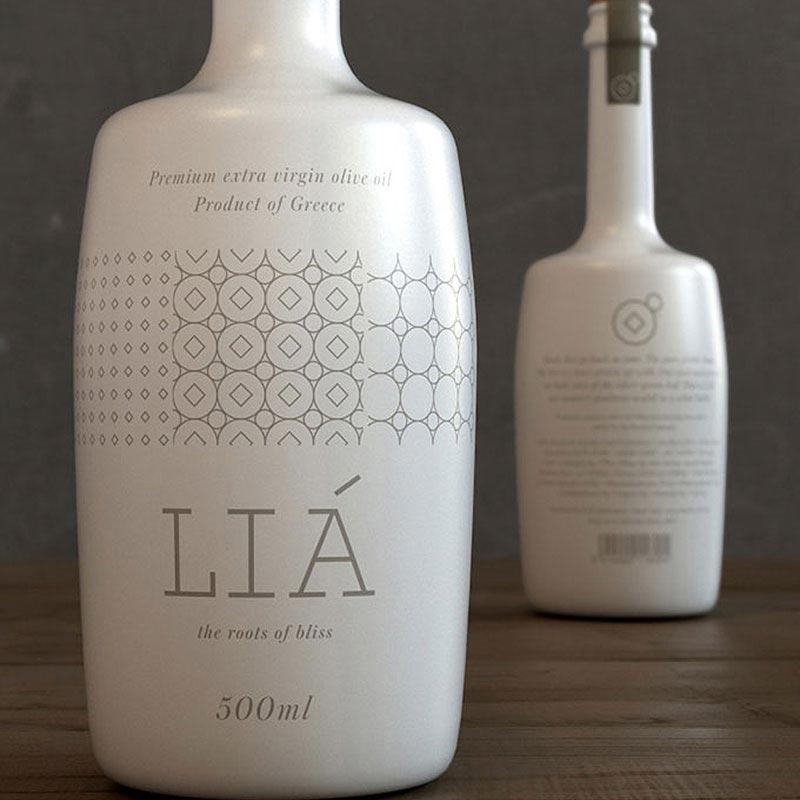
Premium quality opaque bottles that wouldn’t look out of place next to the finest wines. It’s hard to really nail the traditional Greek ‘look’, and yet still seem contemporary in its execution, but Lia seem to have pulled it off quite nicely.
Didino Olive Oil
Designed for the dinner table, Didino Olive Oil is beautifully presented in a white cloth sleeve. Sat next to the chilled white, this bottle and package design would sit perfectly at home.
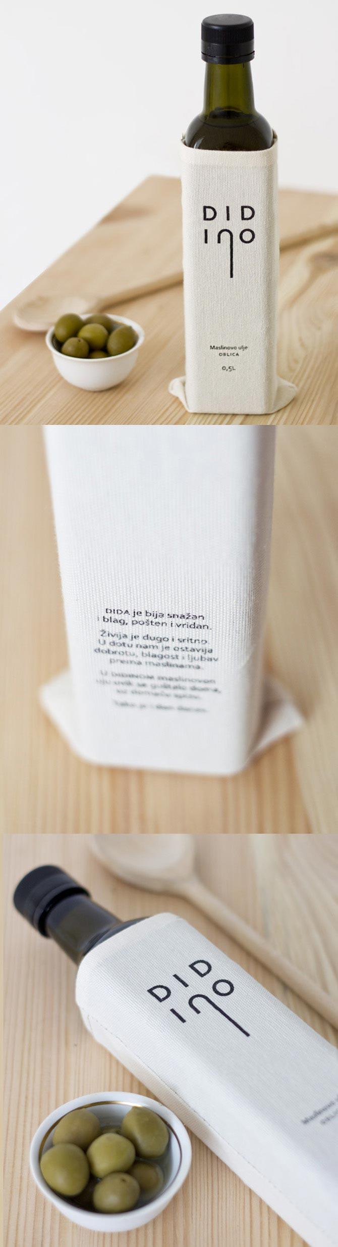
Didino’s elegance is in its simplicity, and understated presentation. The deep green of the glass, and complementary black of the lid is perfectly contrasted with the creamy white of the cloth sleeve. The word ‘Didino’ can be translated as ‘Granpa’s’. Indeed, the extended ‘n’ of the brand name is meant to represent a cane. Tastefully inserting a reference to the client’s grandfather, who started the business, is just another classy addition to an already classy product design. Olive oil has become a staple for many homes across the world, and why not? It has been used for thousands of years, and for good reason. Some things shouldn’t change while others, like package design, need to adapt to ever changing demands of the consumer. As ingrained as olive oil is our world, new packaging designs are always welcome – these help us find new blends and varieties, which otherwise may stay on the shelf while the tried and tested brands hold onto their crowns. New brands rely on exquisite design, and that is where professional package designers can really move a product forward.