Luxury Coffee Branding and packaging
The packaging for coffee is something that not many of us think too closely about; for most it’s purpose is to prevent your pockets filling with grounds and beans, or to keep work surfaces a little cleaner.
For others, the design of coffee packaging is almost an art form – and with some of the exquisite designs on offer, perhaps they are right.
There is no doubt, however, that coffee houses and packaging design agencies have changed the way we look at coffee forever.
We are no longer presented with a bland looking jar, or foil bag, and be expected to be inspired to make that purchase.
The overall look of the packaging should reflect the origins of the contents, or the ethos of those responsible for making it.
The following are perfect examples of beautiful packaging, and how the coffee house / packaging design agency came to the design decisions that they did.
DREUX & GHISALLO’s packaging choices were inspired by the traditional aspect of the company’s background, and the old world values of it’s origins.
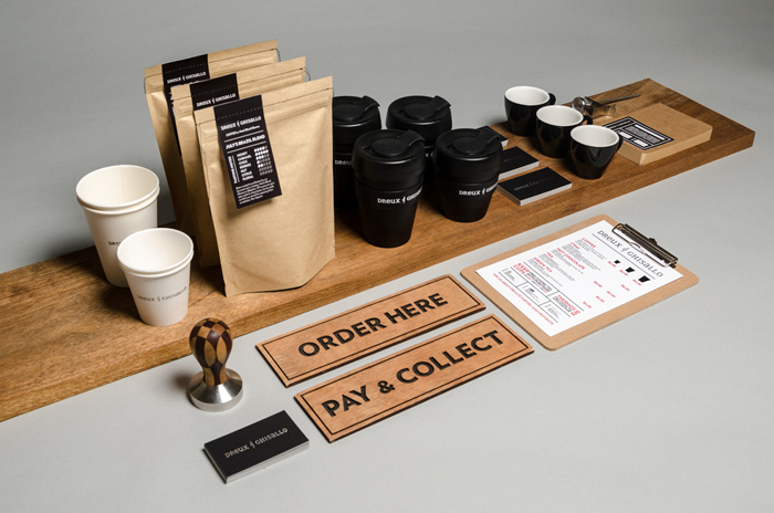
The coffee brand itself revolves around two patron saints, one of coffee (Saint Dreux) and the other of cycling (Madonna del Ghisallo).
The latter is of particular note, as this particular brand of coffee, made by Monk Bhodi Dharma, is sold by vendors on pushbikes.
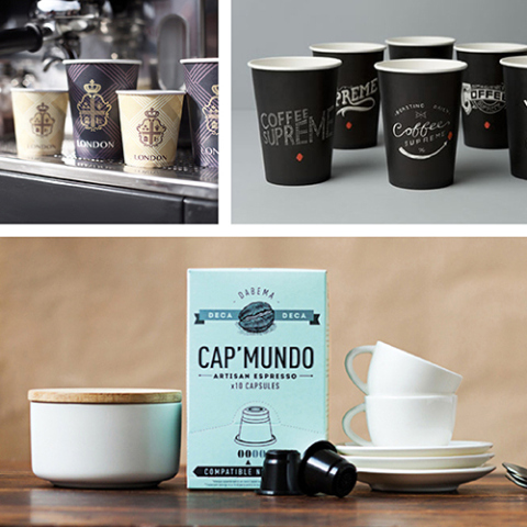
Contemporary design has a place in the coffee packing design world too, and can be broken down in to ‘sub sets’. For example, there are the soft pastels of Cap’ Mundo that convey an air of relaxation and quiet contemplation (something that goes over quite well with the coffee drinking, one should wonder).
Then there is the more striking contemporary design of, say, CIELITO.
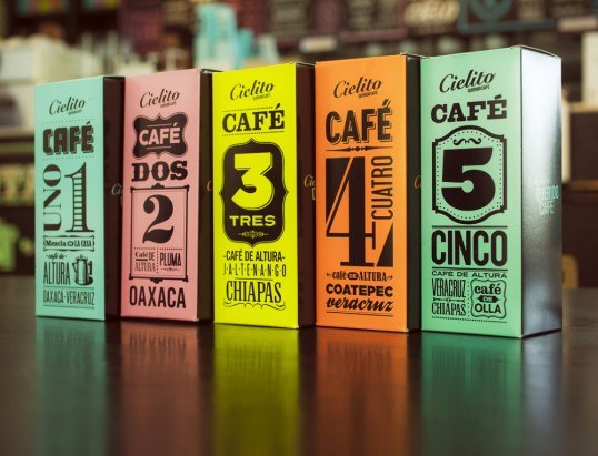
This Latin American coffee house draws inspiration from Mexican history: sports and pastimes, the intense but still earthly colours…
The packaging used, in it’s entirety, can be seen as both authentic to the history of the region, yet oddly contemporary with it’s use of the colour and the stylse used for the creation of the consumables.
With or without the more modern cup styles, the packaging used for the coffee itself would not look out of place in a contemporary cafe or kitchen.
The use of colour, graphics and lettering combine wonderfully to create a uniquely Latin, contemporary, product with wide ranging appeal.
Taking inspiration from the region that the coffee is grown in, and producing exceptional packaging designs, is something that has not been overlooked by the larger brands either.
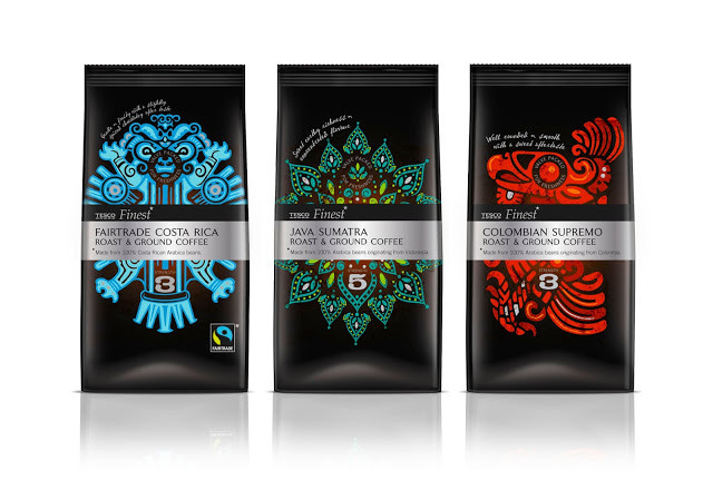
Tesco Fine Roast & Ground packaging is nothing short of stunning. The coffee itself has been selected from, specially, around the world. And with the growing regions including Costa Rica, Indonesia and Guatemala one would expect the coffee to be of a certain quality.
Colourful, vibrant graphics that are almost instantly recognisable as being depictions of icons from the growing regions really help sell the idea of international style and taste.
High quality black, matte bags have a luxurious tactile quality about them, while the vibrant metallic ink creates a visually unique look for each pack, whilst making a strong premium range and, perfectly, fits in with rest of the Tesco Finest brand.
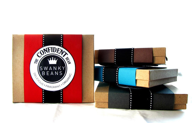
A unique product requires, of course, unique packaging and the items on offer from Swanky Beans are certainly no different.
On first glance, if you didn’t pay too much attention to the label, you would not even realise that these little packages contained coffee.
In fact, they contain a very ‘special’ coffee indeed. And what packaging! From the moment you pick this up you feel you are being treated to something very different; it feels more like a Christmas gift than something you will be drinking with excited trepidation.
Ah yes. I said trepidation, didn’t I? Swanky Beans specialise in a unique brand of coffee. The Kopi Luwak. If you haven’t heard of it, take a look at this wiki page.
Some packaging designs are so on the nose, so obvious, that sometimes you wonder why it wasn’t done before. The containers created for Bookcafe Ground Coffee, by the packaging design agency involved, is one of the more striking examples of this – in a good way too, thankfully.
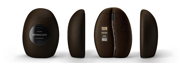
Bookcafe Blend Ground Coffee, is a local brand that has sprung from ‘Bookcafe’, the very first coffee shop and library in the country of Uzbekistan.
The brief, for the packaging of the Bookcafe Blend coffee was to demonstrate the premium quality of the Bookcafe coffee blend.
The coffee comes in dark and medium roast that is represented nicely by the colour of the package. Bookcafe Blend immediately stands out from other available blends in the local market too, with its coffee bean shaped light package which has beem made out of soft food plastic. This exquisite and unique product was originally sold as a limited edition. And what an edition that is!
Our next introduction is for a coffee brand that is no stranger to quirkiness and the unique. Here, is Coffee Supreme.
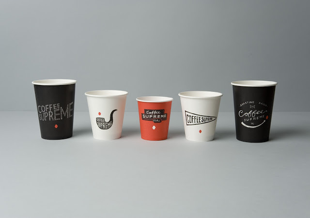
In order to properly communicate some of the company’s quirkiness & character, as well as the hand-crafted nature of their business, the designs give a nod to old hand-made signage – including 1800s product labels and sign-writing, 1930s movie titles and early neon.
There are 16 designs in total, each with a different illustration, painstakingly hand drawn by the packaging design agency in paint, ink, chalk and pencil. The cups come in three different colours from the brand palette, allowing them to be easily distinguished by cafe staff and customers.
This packaging design is also unique in it’s approach, the pattern used is actually a photograph of the area the coffee is grown, and roasted, for the coffee house; Ubatuba is a town on the southeast coast of Brazil.
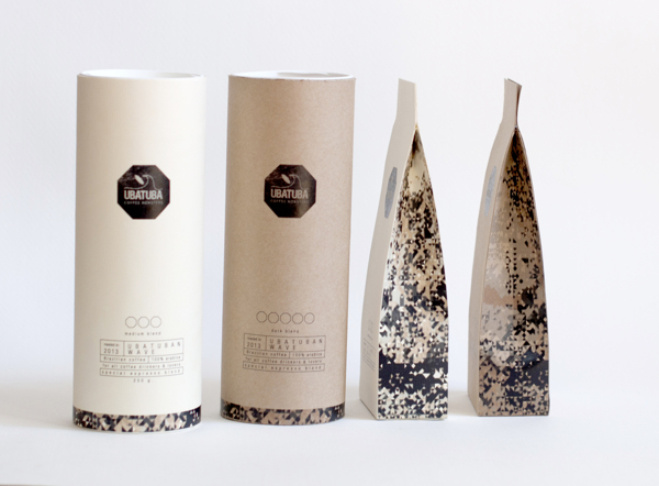
The image is highly pixelated, with a filter overlay to produce the brownish tones – an attempt to remind the viewer of coffee.
The whole look works rather well, with the subtle local references and earthy colours.
When it comes to coffee consumption, and which country leads the way, you would be forgiven for immediately thinking that it would be somewhere in the Americas.
One part of the world that probably wouldn’t pop into your head is Norway.
Norwegians drink the most coffee in the world at 10.7kg per person (compared with around 3kg in the US – who you may expect to consume much more).
Not too long ago, one of the oldest coffee houses in Norway, Solberg & Hanson underwent an incredible rebrand. Solberg & Hansen was established in 1879, so preserving their legacy, while also illuminating the premium quality of the product, led to an impressive luxury coffee brand that remains warm and approachable.
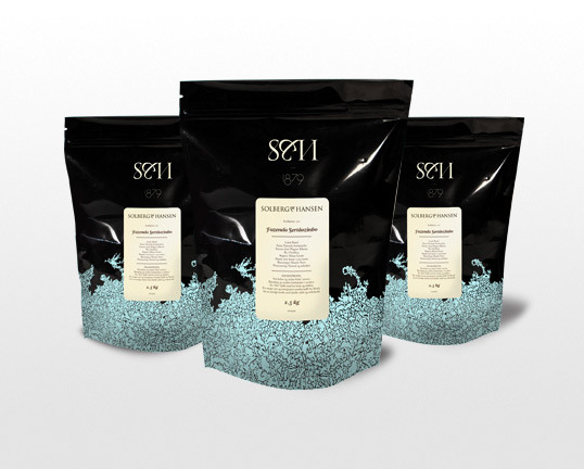
The blue of the slightly unusual pattern, against the glossy black of the background is incredibly eye catching and immediately throws up images of an ocean against a night sky. These things may not necessarily relate to coffee, but they certainly do to Norway – which was the whole point to begin with.
We have spoken about contemporary design, with pastel colours and the slightly more vibrant type used by a Latin American coffee house, but there is another kind of contemporary. A more modern, sleek type that can always be seen in art galleries and wine bars.
This is the kind of approach taken by Eos Coffee house. Even its name, though ancient, fits perfectly – Eos is the Greek Goddess of dawn. Since most mornings do not feel as though they have started without a coffee, Eos fits like a glove.
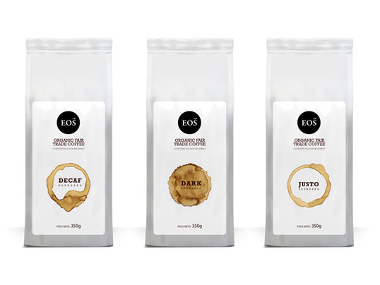
The packaging used is deceptively simple; uncluttered and clean – you can easily identify the strength of the coffee by the ring… Right there on the label. Brilliant.
When thinking of location, it can sometimes help reference an original source. For example, the Coffee House London is not actually in London – you will find it in the Ukraine. London has long been seen as the birthplace of the coffee house, so why not reference it?
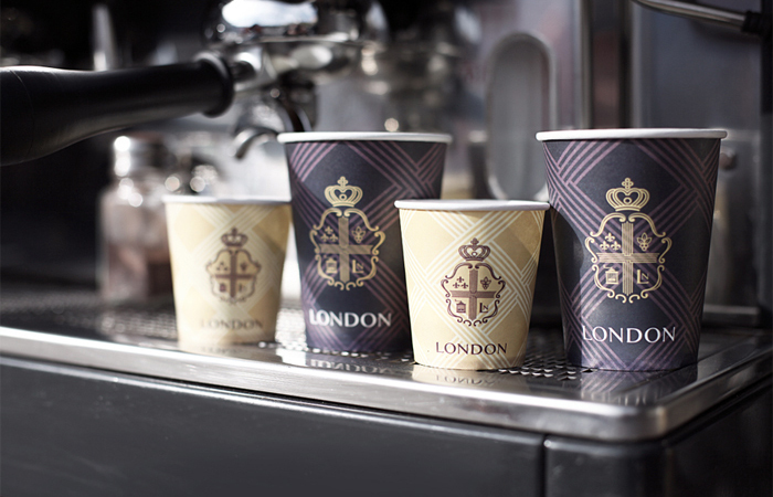
For their packaging, the design agency went one step further than just referencing the name. When piecing together the crest, they used iconic imagery from the city itself.
So next time you fancy a Starbucks…maybe indulge in something a little more luxurious, a little more stylish and a lot more beautiful!
Need help with your coffee brand?
whether your a start-up or looking for a re-brand - we can help.