Goupie Confectionary
- Illustration/
- Creative Direction/
- Packaging Design/
- Photography/
- Structural Packaging
We worked with Simpson’s of Hawkhurst – a family-owned confectioners based in Kent – to modernise their branding and create chocolate package design for their flagship brand, Goupie. It was important to maintain those rich, home-made, artisanal values, while also creating something that would sit proudly in delicatessens and trendy inner-city food halls.
Nominated for Cartonboard Pack of the Year
THE STRATEGY
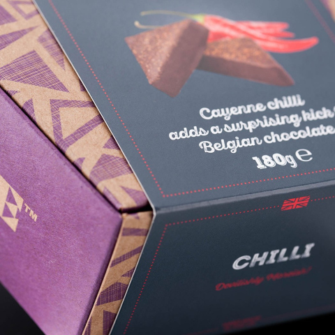
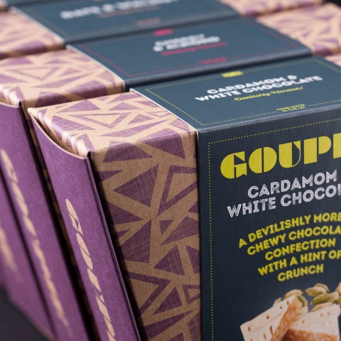
Whereas the previous Goupie branding was suitable for local farm shops and markets, the new styling needed to be more striking, modern and aspirational. We set about crafting an identity that expressed their core values of taste, affordability and indulgence. And because sustainability is also central to their business, we made sure that our new packaging designs could be printed purely in CMYK, making them all fully recyclable.
THE CREATIVE
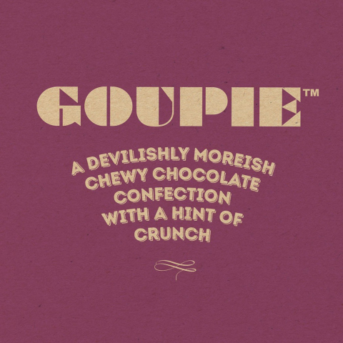
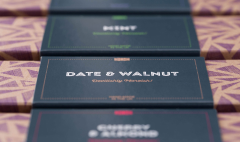
We created a striking new look for Goupie, with strong shelf appeal, but in a way that maintained the brand’s existing character. We wanted every item to reflect its hand-made pedigree and feel individual, while also being just as moreish as only the best chocolate can be. Each flavor of Goupie also has its own colour palette and imagery to give extra personality. Both the photography and the post-production were done in-house, to ensure that every shot oozed desirability.
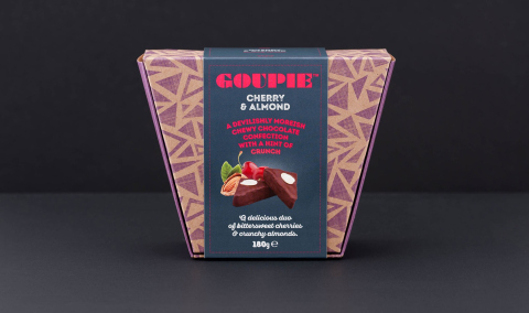
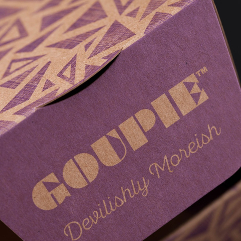
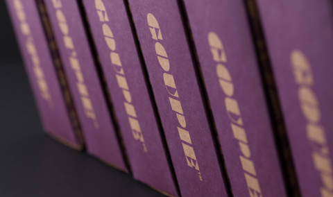
We developed a distinctive trapezoid carton design, building on their heritage of hand-cut triangular chocolates, and the practicality of their existing ‘takeaway’ Kraft-style boxes. And each was adorned with a unique triangular print in Goupie’s brand purple, giving them a regal and sophisticated touch. The trapezoid shape also offered a great many opportunities for retailers to create interesting builds and displays at point of sale. All of this was designed specifically to help Goupie stand out in-store, because we knew that if we helped catch the eye, then the chocolate itself would do the rest.
THE OUTCOME
The new designs really gave the public something to chew on, and opened up new retail opportunities for Goupie. The cartons were nominated for Cartonboard Pack of the Year 2016 and they have since won awards in both sustainability and Free From categories.