Baby Skincare Product Packaging
When it comes to baby products, we seldom think of chic, stylish or even fashionable. The things that we do think of are either not repeatable, or are just as far removed from ‘style’ as it is possible to be.
Baby products are very often thrown into two very corners – plain, simple pastel colours and the cartoonish.
It is not that often we see baby products with flair and style; the kind of thing that we could happily place next to our own on the bathroom shelf, without throwing off the decor or looking like Pee Wee Herman just moved in.
It takes a special kind of packaging design team to come up with a packaging idea that says ‘baby’, without saying ‘eugh, baby stuff. Again.’.
Here we have our top ten favourite packaging/branding ideas from the baby aisle
CocoonU
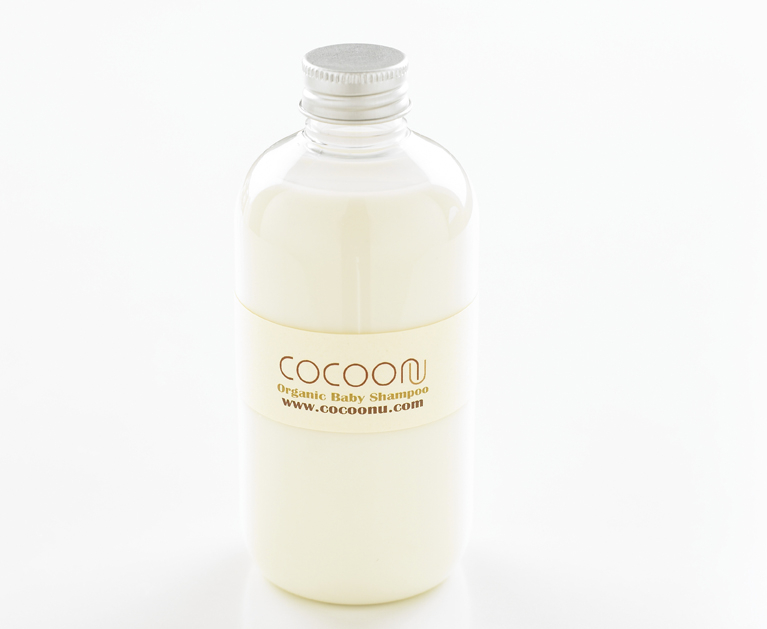
Established in 2006, the CocoonU brand sources its materials from the UK, as well more exotic places like Mongolia & Peru.
Despite the prestige associated with this kind of sourcing, the packaging itself (for this gentle baby shampoo) is very minimal, and wouldn’t look out of place in any bathroom. Chic, functional and inconspicuous? We’ll take two!
Babies Only
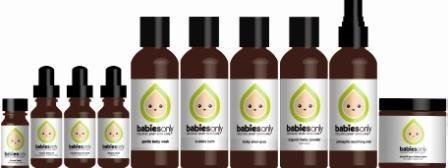
The Babies Only organic range of skincare products, has been specially developed in conjunction with a Pediatric Herbalist and an Aromatherapist.
It is easy to see where the influence for the packaging came from, but it still manages to inform the observer that it is intended for our little ones (but no doubt, it is great for mum’s skin too). The packaging designer has done a good job in bringing the classic apothecary design into the 21st century, without it looking dated or even out of place in a more modern medicine cabinet.
Zodiac Baby
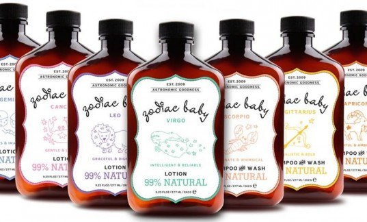
What could be more adorable, for a new baby gift basket, than a gorgeous bottle of baby wash / lotion, complete with the baby’s astrological sign?
This is exactly what the new line Zodiac Baby offers, along with many sustainable features. The Zodiac Baby product range was created for our small people aged 3 months and beyond. The package design is gorgeous enough to allow this range to be displayed, rather than shut away in a bathroom cabinet.
Little Twig
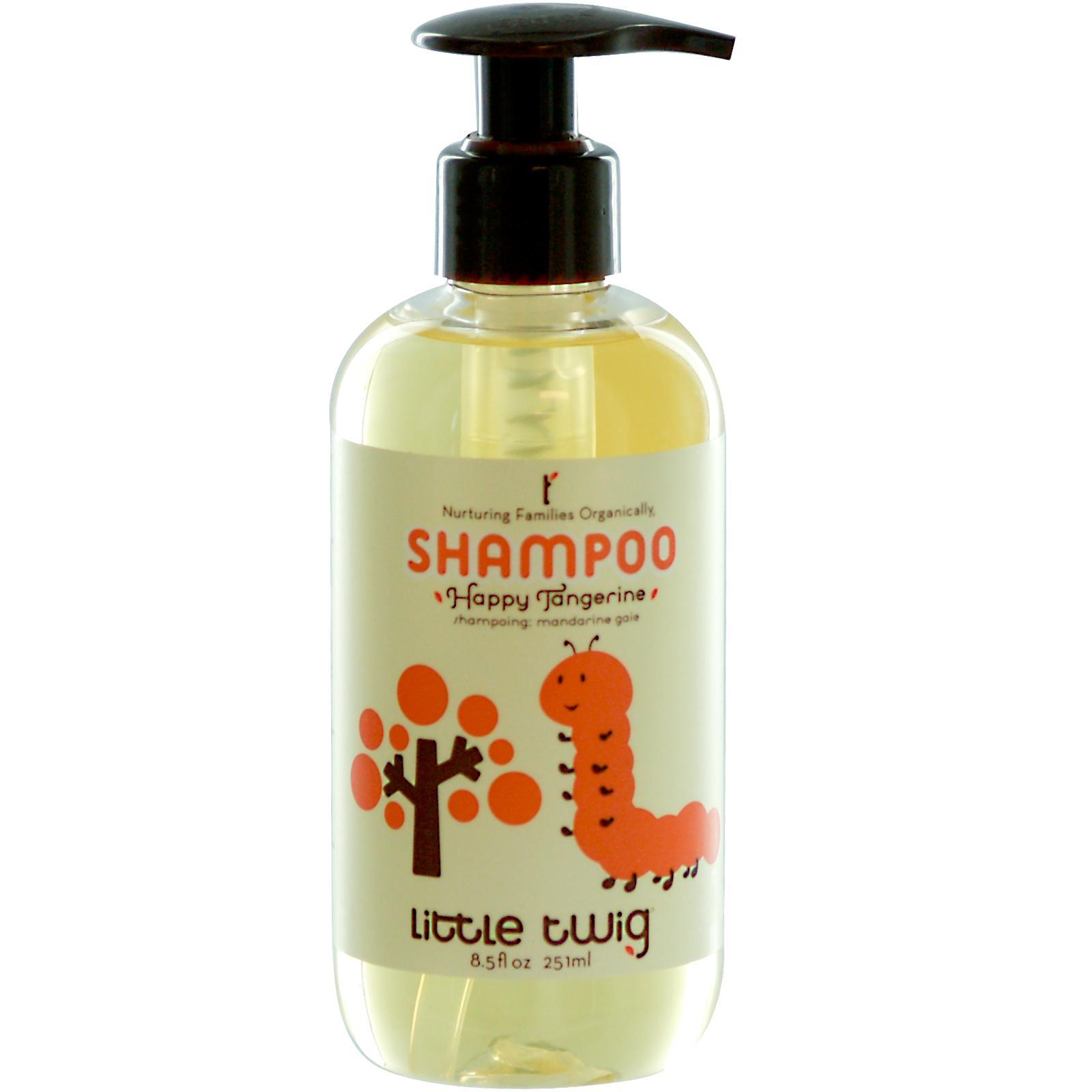
For those of you a little more traditionally minded, at least when it comes to baby products, then the Little Twig design may well appeal.
The playful characters are coloured depending on the individual product line, making identification simple and fast. Pump bottles make dispensing super easy, as any parent of small people know’s – this is sometimes vital when you may only have half a hand free!
Little Twig’s design is unmistakably, practical, functional and clearly aimed at the slightly younger market (or, at least those that look after the younger market). The good folks behind Little Twig also have a recycling program, meaning that the little ones you look after today, can have a brighter future tomorrow.
Erbaorganics
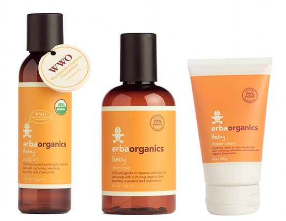
Everything about the Erbaorganics baby range says ‘clean & natural’, with most of that being attributable to the package design itself.
Whites and earthy tones have always been associated with ‘natural’, and professional package designers will very often take advantage of that fact, knowing that our subconscious will always see items designed this way as being the better option. Perhaps it reminds us of cleanliness because of the association with sterile environments (which are, predominantly, white)?
Erbaorganics products are all free from anything that could be potentially harmful to your babies skin, or even your own, just the way it should be.
Plus, with a handy little travel bag, you can take these lovely little washes and lotions on the move with you too!
Estelle & Thild
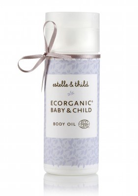
Soft pastels are the order of the day here, and the packaging looks just like it would if the product was intended for an adults use.
The cylindrical design, pastel colouring and the dainty ribbon do say ‘feminine’, but that’s not a bad thing when it comes to baby, is it? A baby’s skin is soft, gentle and precious – the Estelle & Thild collection is designed to protect this most precious of layers, and the packaging is a reflection of the fragility being protected and soothed.
Dr Bronners organic baby
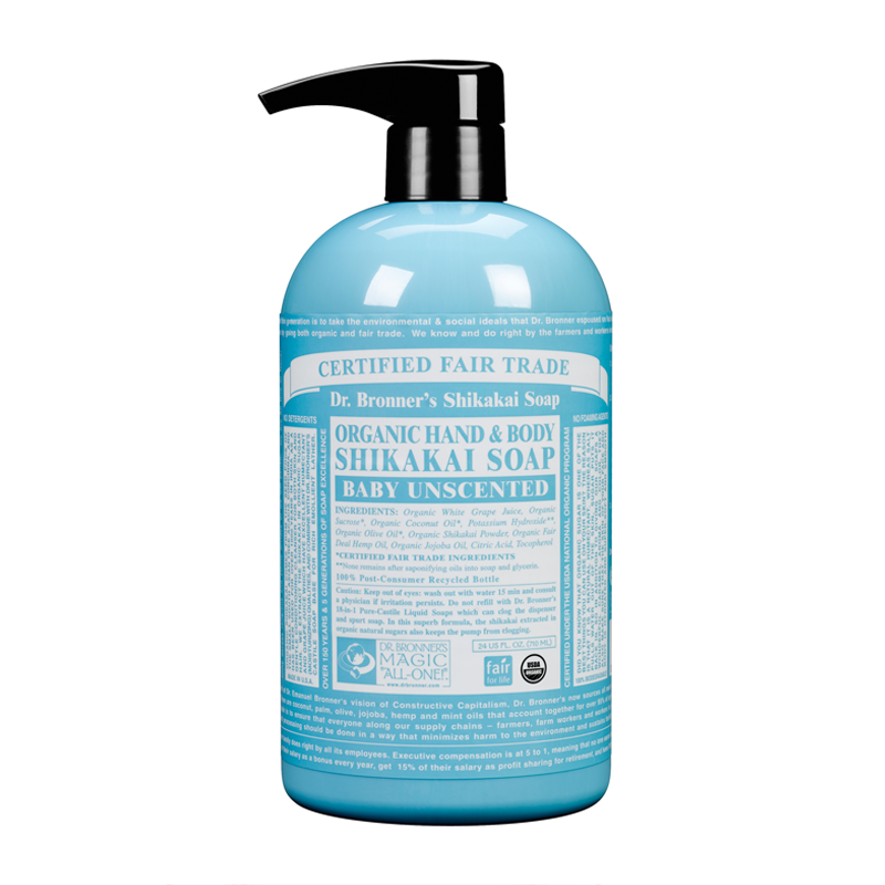
The humble hand pump is in attendance again, and for good reason – pumps are easier to use one handed, for a start, and that by itself is enough to make it a winner for those with babies.
The container itself is simple enough in its design, with nice clean lines and bright colours it is sure to make an excellent compliment to the bathroom. Several of the products here in our top ten can be said to be ‘chic’, and this is no different.
The purely typographical design being reminiscent of old-fashioned medicinal packaging of a by gone era which supports the ‘Dr Bronner’ Brand name. There is no cutesy imagery to initiate the ahhh factor, just good typography laid out in a hierarchy of information. Refreshing.
Little Green
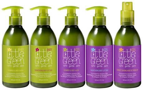
“As close to nature, as you can be”. The strapline is one explanation for the colouring of the packaging for the Little Green line… Other than it is called ‘Little Green’, of course.
Natural ingredients and full of vitamins; these are the things that the designer was trying to convey, and no doubt the founder of Little Green too. Once again, the handy pump makes an appearance proving that it is function over form that is taking precedence in a lot of these container designs.
This is a collection of products created to live up to claims which disappointingly so many others don’t; Safe, gentle and pure, Hypoallergenic formulas, free of Parabens, Sulfates and Allergens, Clinically and Dermatologist tested.
Brauer
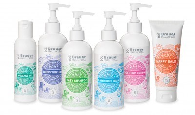
A running theme with baby products, and one that package designers are keen to push to the fore, are the statements of effect. That is, how gentle the product is etc.
Brauer products are no different in this regard, but there is one little addition that seems to be missing from the others – “eczema-friendly”. Anybody that has a child with eczema can tell you just how important it is that a body wash designed for sensitive skin, really is as gentle as it claims.
While the eczema-friendly claim is not prominent, other related details are and this all part of the marketing drive, making the packaging as memorable and eye catching as possible.
Method baby
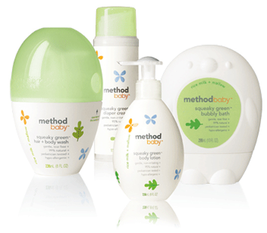
Shaped as cute little animals, there is no mistaken what the intended audience is with the Method baby range.
As with most of the others, Method have taken the ‘soft and gentle’ approach with their marketing, and extended this to the bespoke container designs themselves with soft colouring and gentle, rounded edges.
The designs mark the products out, clearly and unmistakably, as being for babies and small children, but there is a certain style that goes with it that means that it wouldn’t necessarily look out of place on an adults bathroom shelf either.
When all is said and done, we all want the best for our babies and this is no different when it comes to choosing a body wash or skin lotion.
The designs on show here display two things very clearly, and without marring the whole ‘chic’ effect of the product design as a whole…
Designed for baby doesn’t have to mean a babyish design, and all of these products are designed to care for and protect sensitive skin.
These two things are evident, on first glance and without being ‘in your face’, and that is the mark of great product package design.